
Motion News
Cool Animation Short Movie by Marie Deboissy
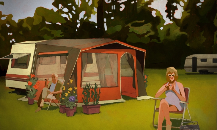
I was just checking the staff picks on Vimeo and found this wonderful animation short movie by Marie Deboissy. I love so much the style of this short that I absolutely had to share it on here for you all, in case you did not see it already.
Colors are so rich and I can really feel the breeze of a hot summer night just by watching this Animation.
Here is the pitch of the story:
Oscar, 17, spends his summer with his mother and Marianne, who is thirty years older than him. This summer, an ardent desire emerges at Oscar for Marianne. Troubled by the awakening of this forbidden passion, an erotic and ambiguous relationship established between them. He will have to consume his desire to be freed from it.
I even like the sound design, subtle and immersive at the same time. Very good Job, Marie 😉
And you all… Enjoy the vision!
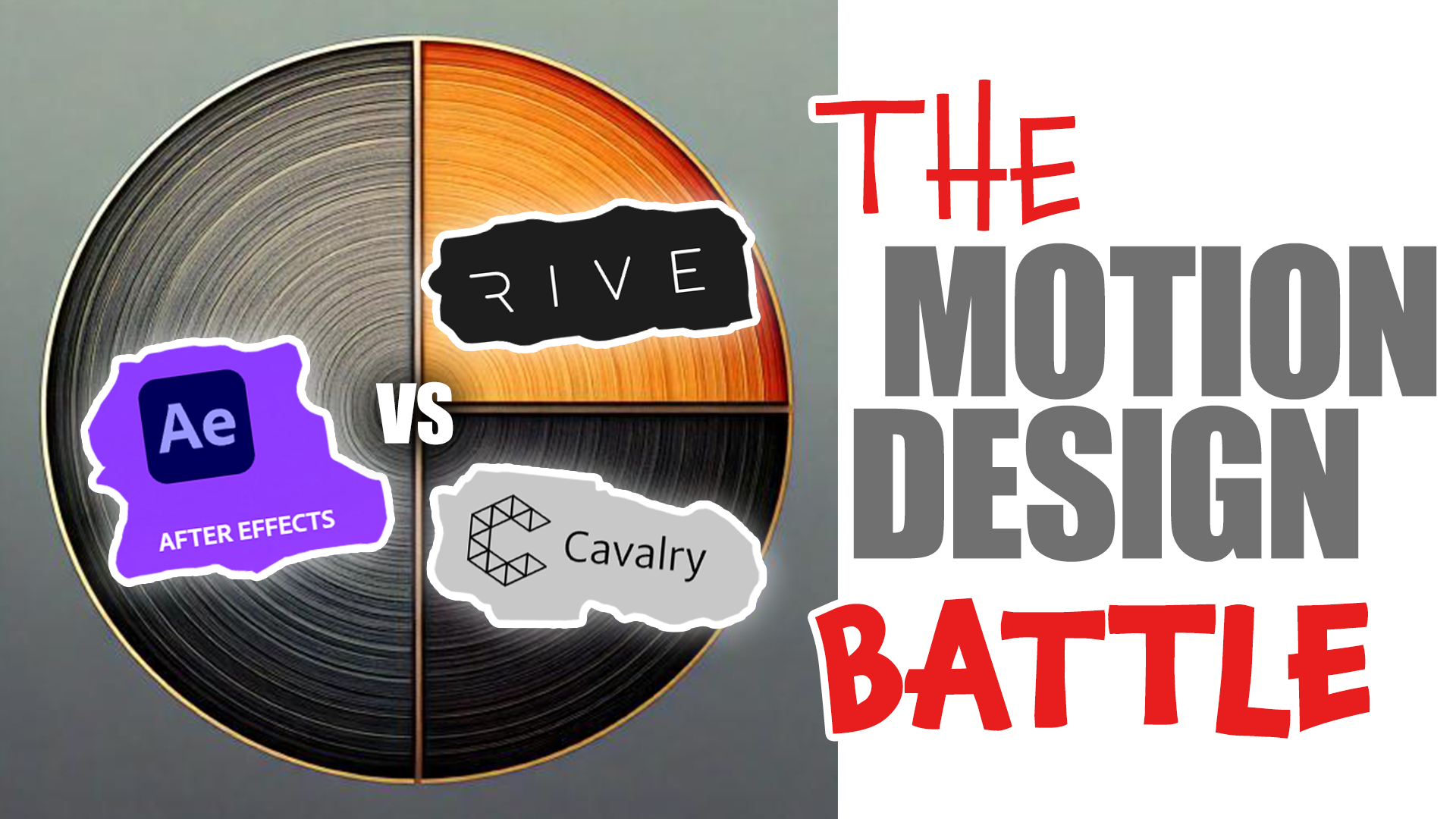
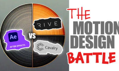
As professional Motion Designers we are called to choose our Tools, among the enormous amount of Animation software out there. Some years ago, Adobe After Effects was the king in the industry but now the situation is different. Sometimes we just need to adapt to the software used by our agency or our client, but in some cases we are free to choose and therefore totally responsible for our choice. What is the best motion design software? Is this not scary enough??
The choice between After Effects, Rive, and Cavalry depends on the type of animation work we do and our specific needs.
1. Adobe After Effects
- Best For: General motion design, compositing, visual effects, and 2D animation.
After Effects has been for years my main tool, I have done 2d motion design, 3d motion design, video editing, video compositing, green screens.. and I appreciate a lot the possibility to create procedural aniations using expressions and even scripting to automate long and repetitive tasks.
Thanks to its enormous ecosystem, made by extensions, plugins, script and templates, it is rather easy to create something complicate animations, by just investing some money in buying the right tool.
It has been on the market for decades, meaning that the base code is indeed old and not optimized to current standards. This explains why you may need a rather powerful machine to make it run fast enough on bigger projects.
Nevertheless, this is still my main tool, where I create and sell scripts that are used by hundreds of designers.
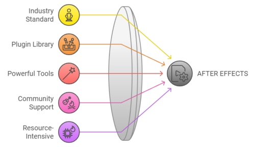
After Effects Pros:
- Industry standard for motion design and visual effects.
- Huge library of plugins and integrations.
- Powerful tools for compositing, keyframing, and animation.
- Supports both 2D and limited 3D animations.
- Large community and extensive tutorials.
After Effects Cons:
- Can be overkill for simple animations.
- Resource-intensive, often requiring a powerful computer.
- Subscription-based, which can be costly over time.
- Not real-time, so renders can be slow depending on the project size.
2. Rive
- Best For: Real-time interactive animations, especially for web and apps.
Rive is having gaining every day new happy users. This web based designer application allows to create smooth interactive animations. In some ways, it wants to take the place occupied in recent years by After Effects with the Lottie plugin. The animations created in the Rive App, can be used in a growing number of client applications.. websites, mobile apps, unreal, games, Figma,… the basic membership is free, while you need to pay for more advanced or team functionalities.
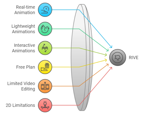
Rive Pros:
- Focused on real-time animations for interactive platforms like websites, apps, and games.
- Lightweight animations, which can be exported as code (WebGL, Flutter, etc.).
- Allows live, interactive animations that respond to user inputs.
- Free plan available, with paid pro options.
Rive Cons:
- Not suitable for complex video editing, VFX, or compositing.
- Limited to 2D animations.
- Smaller community compared to After Effects.
3. Cavalry
- Best For: Procedural motion design and data-driven animations.
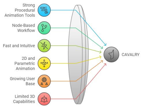
Cavalry has been around for some years and is steadily growing. The base code is more recent and optimized compared to After effects. If you feel that 2D procedural animation is your thing, Cavalry might be your best choice, with faster previews and internal functionalities that are only available through external plugins in After Effects.
It is completely vector based, and you will surely appreciate the possibility to import SVG images, while this is not possible in After Effects.
Cavalry Pros:
- Strong procedural animation tools that allow you to create complex animations with minimal effort.
- Node-based workflow, ideal for data-driven design.
- Fast and intuitive, with real-time feedback, which is great for iteration.
- Can handle both vector-based 2D animations and more complex parametric animations.
Cavalry Cons:
- Still growing its user base and learning resources.
- While it has some 3D capabilities, it’s not as robust as dedicated 3D software.
- Less well-known and not as universally adopted as After Effects.
Conclusion:
- After Effects is ideal for general motion design, visual effects, and any work that requires a wide range of tools and compositing features. It’s perfect for freelance projects that need versatility. As a freelance motion designer, this is still a compulsory tool to find a decent number of clients.
- Rive excels in interactive and lightweight animations for web and app platforms, and is great if you’re working with developers to create real-time animations. If you are old enough, you may remember Flash was doing similar things. Well, it looks that Rive is doing it better.
- Cavalry is perfect if you want a more procedural approach to motion design, particularly for data-driven or parameterized animations.
What is the Best tool for Commercial Projects?
When it comes to money, and not only technical aspects, we need to consider how many designers use rive and Cavalry. In big studios and Agency, all of the designers know After Effects and it could be tough to use new applications, whose formats are not compatible with the industry standard. This will change overtime, as more specific projects will be done with the tool that works best, but for the moment, After Effects rules.
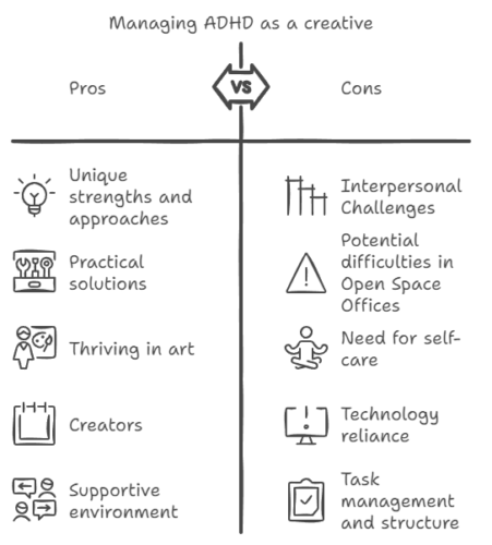
Managing ADHD as a creative individual, a designer, a content creator, can be both challenging and rewarding. Let’s explore effective strategies and techniques tailored specifically for creatives to harness their unique strengths while mitigating the difficulties associated with ADHD. By understanding how ADHD affects creativity and implementing practical solutions, individuals can finally thrive in their artistic pursuits… and it is never too late!
Understanding ADHD in Creative Individuals
ADHD, or Attention Deficit Hyperactivity Disorder, often manifests as difficulties with focus, impulsivity, and hyperactivity. For creatives, these traits can lead to a whirlwind of ideas and inspiration but may also result in challenges such as disorganization, procrastination, and difficulty completing projects. Recognizing these patterns is the first step toward effective management. Personally I have been struggling with these issues for most of my life. I have always considered myself as a very creative person, a good motion designer, but when it came to structure and tasks out of my interests, I had problems who made my anxious and even depressed.
Strategies for Managing ADHD
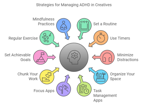
1. Embrace Structure
While creativity often thrives in chaos, establishing a certain level of structure can help manage ADHD symptoms. Consider the following:
- Set a Routine: Create a daily schedule that includes dedicated time for creative work, breaks, and other responsibilities.
- Use Timers: Implement techniques like the Pomodoro Technique, where you work for 25 minutes followed by a 5-minute break, to maintain focus.
- Structured colleagues: if you work alone, you may want to look for an associate, colleague or friend with high organizational skills.
2. Create a Conducive Environment
Your workspace can significantly impact your ability to concentrate. Here are some tips:
- Minimize Distractions: Identify and reduce distractions in your environment, such as noise, clutter, or digital interruptions.
- Organize Your Space: Keep your workspace tidy and organized to help maintain focus and clarity.
3. Leverage Technology
Utilize tools and apps designed to aid productivity:
- Task Management Apps: Use apps like Trello or Todoist to keep track of projects and deadlines.
- Focus Apps: Consider apps like Forest or Focus@Will that help maintain concentration through ambient sounds or gamified focus techniques.
4. Break Tasks into Smaller Steps
Large projects can feel overwhelming. To combat this:
- Chunk Your Work: Break down larger tasks into smaller, manageable steps. This makes it easier to start and maintain momentum.
- Set Achievable Goals: Establish short-term goals that lead to your larger objectives, celebrating small victories along the way.
5. Prioritize Self-Care
Taking care of your mental and physical health is crucial:
- Regular Exercise: Engage in physical activity to help manage symptoms and boost mood.
- Mindfulness Practices: Consider meditation, yoga, or deep-breathing exercises to enhance focus and reduce anxiety.
6. Seek Support
Don’t hesitate to reach out for help:
- Therapy or Coaching: Working with a therapist or coach who specializes in ADHD can provide personalized strategies and support.
- Join a Community: Connect with other creatives who have ADHD to share experiences, tips, and encouragement.
Conclusion
Managing ADHD as a creative designer requires a blend of understanding, structure, and self-care. By implementing these strategies, creatives can harness their unique abilities while navigating the challenges of ADHD. Embrace your creativity and remember that with the right tools and support, you can thrive in your artistic endeavors.
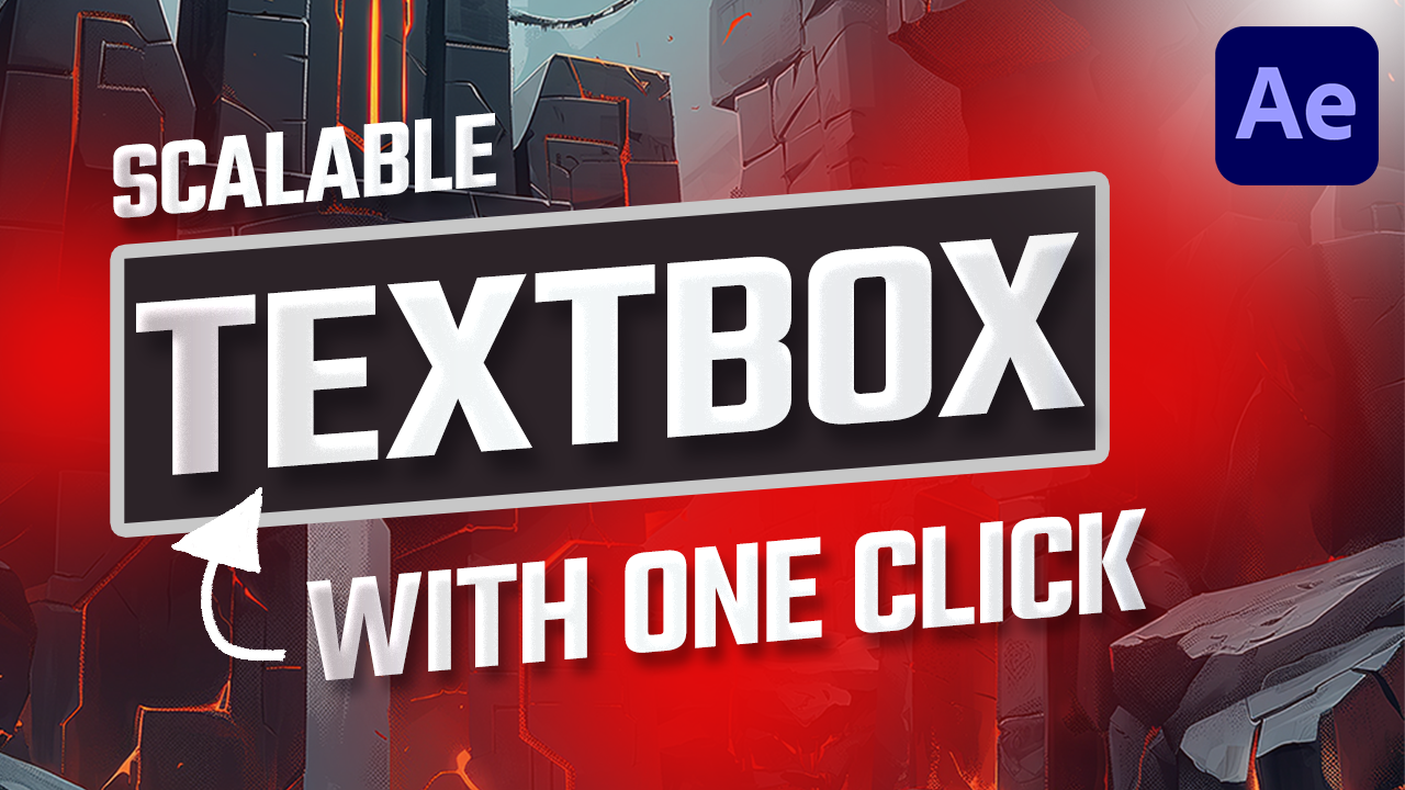
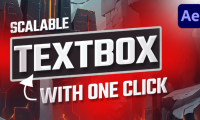
Are you ready to level up your Motion design game? Well, buckle up, because I’m going to show you a game-changer—the brand-new “2D Text Box (Mask and Effects)” preset!
No more hours of code, no more frustration, no more searching for outdated tutorials just to put a simple box around your text. This is the HUGE improvement we’ve all been waiting for, and it’s going to change the way you work.
It has been added to After Effects cc2024 in the last months, so you don’t have to pay anything more.. it’s part of your Adobe Subscription, together with the tons of other presets and effects.
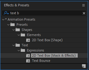
How To Use the Text Box Preset
1. All you need to do is to Create a Text Layer with the text you need.
2. Then go to the Effects and Presets panel and look for: 2D Text Box (Mask and Effects)
3. Drag it over your text layer to apply it.
4. Edit the properties you want to change in the effects control panel.
The great news is that it is self adapting to the text. For instance, if you put a text animator on the layer, the text box will adapt to the content at each moment.
You can also change the Padding, the roundness and direction of the corners, even individually… so you can set a round corner on the top left, while keeping square corners on the others.
Of course each and every color is easily accessible in the effects properties panel, together with all the configurations for the fill and the lines.
Personally, I have always been using some of my expressions when I needed text boxes. Having a developer background helped me in the past.. but frankly, since when I discovered this new textbox preset, I have being using it almost exclusively!
This is THE tool motion designers have been dreaming of. You’ve got total creative freedom, and you can focus on what really matters—your design, not wasting time coding!
And that’s it! The brand-new “2D Text Box (Mask and Effects)” preset is here, and it’s going to change the way you work forever. Say goodbye to coding stress, and hello to creative freedom!
So, what are you waiting for? Go try it out and let me know in the comments how much time it’s saving you.
-
 Motion News9 months ago
AFTER EFFECTS vs RIVE vs CAVALRY
-
 Motion News2 years ago
CapCut vs Premiere Pro: The Ultimate Video Editing App Showdown
-
 Tutorials3 years ago
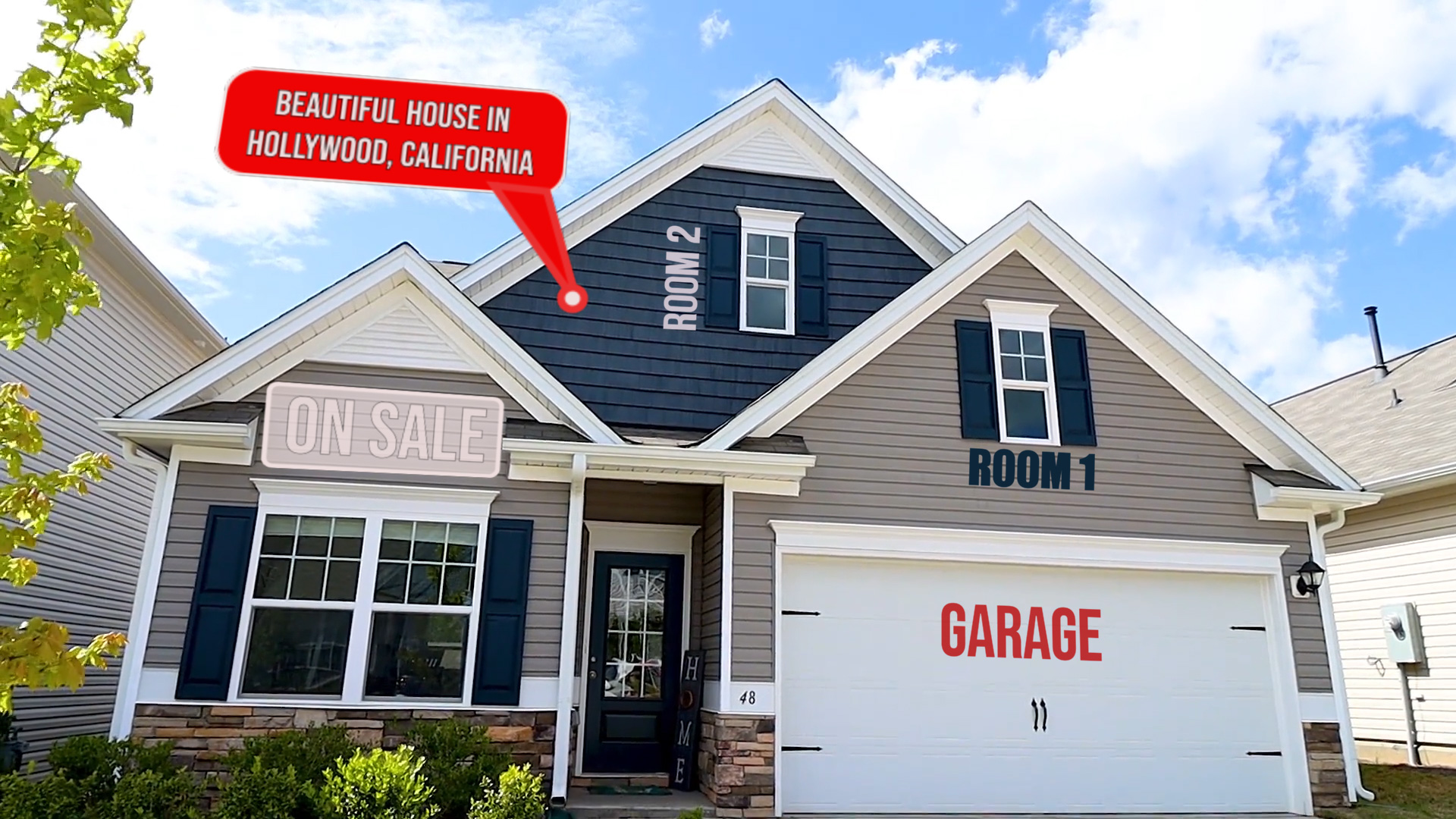
How to track real estate and callouts in Adobe After Effects
-
 Motion News9 months ago
The New 2D Text Box Preset in After Effects
-
 Tutorials2 years ago
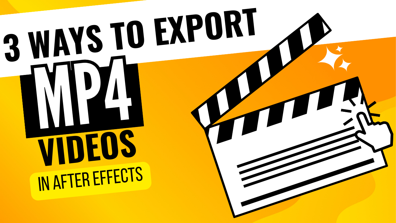
How to export mp4 videos from After Effects | 3 methods to export
-
 Motion News9 months ago
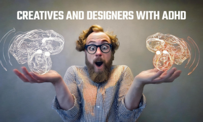
Managing ADHD for Creative Designers
-
 Tutorials5 years ago
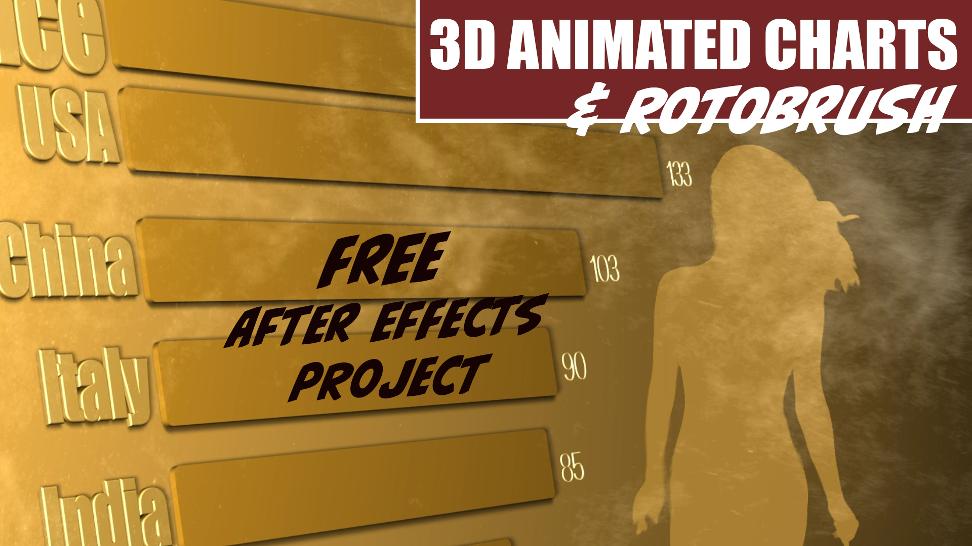
3D Animated Infographics in After Effects and Rotobrush 2 Tutorial
-
 Motion Graphics3 years ago
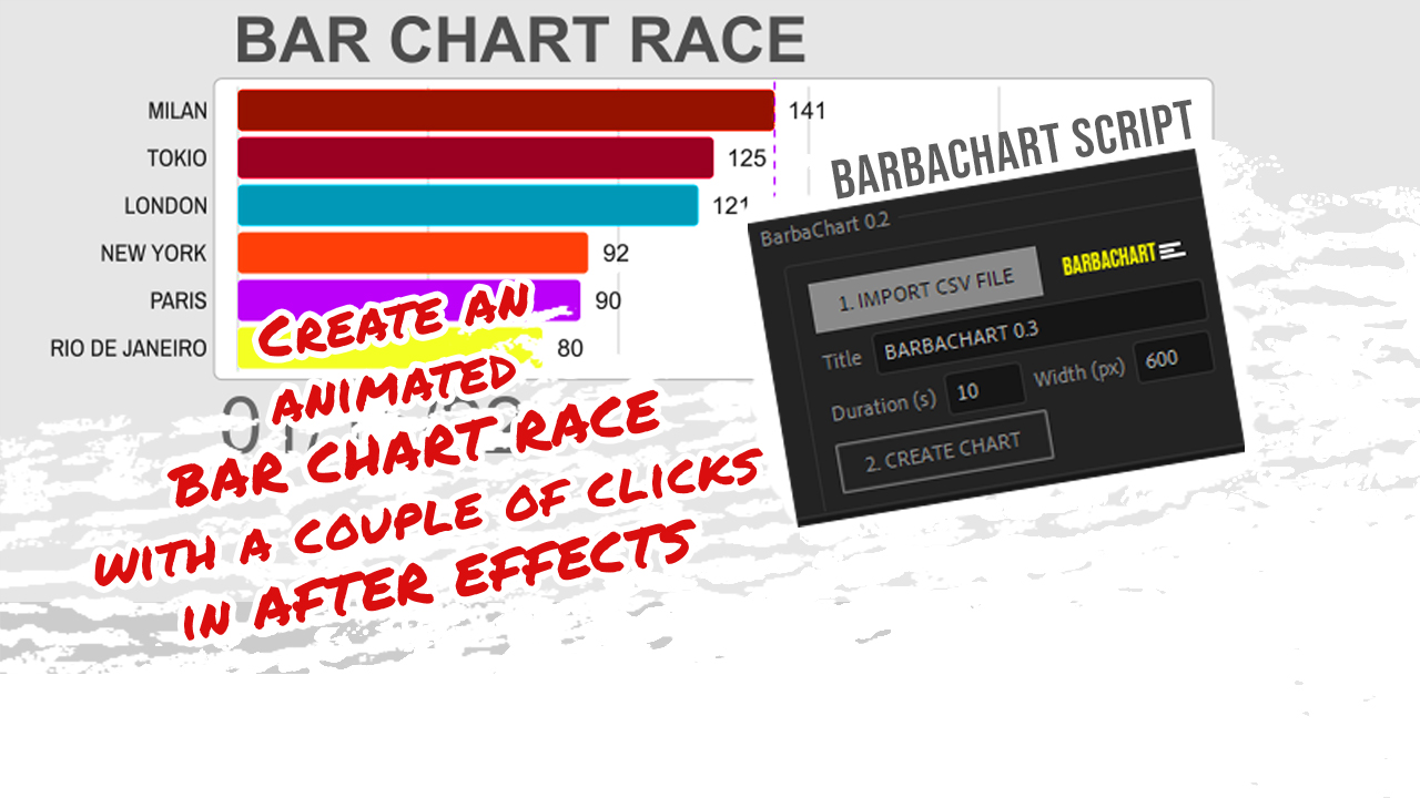
BAR CHART RACE script for After Effects – BARBACHART