Connect with us

Motion News

CapCut vs Premiere Pro: The Ultimate Video Editing App Showdown

Published

on

In the digital age, video editing has become an essential skill across multiple industries. Whether you’re a professional filmmaker or a social media content creator, picking the right video editing app can make all the difference. Two names that often pop up in the conversation are CapCut and Premiere Pro. But how do you know which one is best for you? This article will delve into various aspects of each app to help you make an informed decision.

CapCut: Video Editing Made Easy

Why Choose CapCut?

For those new to video editing or those who prefer a simplified interface, CapCut is an excellent choice. With a design that prioritizes user-friendliness and intuitive controls, it’s an ideal starting point for novices. Its drag-and-drop functionality simplifies the process of importing, arranging, and editing clips.

Features and Functions

Despite its beginner-friendly approach, CapCut offers an impressive range of editing tools and effects to improve your videos. You can trim, crop, and merge clips, adjust brightness and contrast, add text and stickers, and even apply advanced effects like motion tracking. While it might not boast the extensive feature set of Premiere Pro, it provides sufficient tools for basic to intermediate editing needs.

Cost-effectiveness

One significant advantage of CapCut is its affordability. It’s a free app available for Android, iOS devices and also Windows PC. You can access most of its features without any cost, making it an attractive option for those on a budget or exploring video editing as a hobby.

Premiere Pro: The Choice of Professionals

Superior Editing Tools

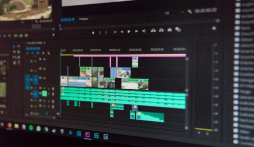
Premiere Pro is a comprehensive video editing software popular in the professional filmmaking industry. It offers an extensive range of advanced editing tools and features, making it a preferred choice for professionals and experienced editors. From multi-camera editing to advanced color grading, Premiere Pro provides the necessary tools to achieve high-quality and polished videos.

Workflow and Integration

Premiere Pro integrates seamlessly with other Adobe Creative Cloud applications, such as After Effects and Photoshop. This integration results in a smooth and efficient workflow. The ability to switch between applications and share project files makes it a valuable tool for professionals working on complex projects requiring different creative elements and Templates.

Performance and Scalability

Premiere Pro is optimized for high-performance editing and can handle large projects with ease. It takes full advantage of your computer’s hardware, including the GPU, to ensure smooth playback and real-time editing. Premiere Pro also supports a wide range of video formats and resolutions, allowing you to work with footage from various sources without compatibility issues.

Comparing CapCut and Premiere Pro

User Experience

CapCut offers a simple and user-friendly interface, very similar to Tiktok internal video editor, perfect for beginners. Its minimalistic design and intuitive controls enable quick and easy editing. On the other hand, Premiere Pro’s more complex interface reflects its extensive feature set. While it may be overwhelming for beginners initially, the learning curve can be rewarding for those seeking professional-grade editing capabilities.

Editing Tools and Effects

CapCut provides a solid set of editing tools and effects suitable for basic to intermediate editing needs. It offers filters, transitions, text overlays, and various effects to enhance your videos. In contrast, Premiere Pro goes above and beyond with its extensive collection of tools and effects. From advanced color correction to audio mixing and advanced masking, Premiere Pro offers full control over your editing process.

Performance and Rendering

CapCut, designed for mobile devices, offers decent performance considering its platform limitations. However, Premiere Pro, which leverages the processing power and resources available on desktop computers, delivers superior performance and faster rendering times.

Learning Curve

CapCut’s simplicity makes it easy to learn and navigate. Its straightforward approach allows beginners to grasp the basics of video editing quickly. Premiere Pro, being a professional-grade software, has a steeper learning curve. It requires time and dedication to master its extensive features and functionality. However, the investment in learning Premiere Pro can open doors to more advanced editing opportunities.

FeatureCapCutPremiere Pro
PriceFree with in-app purchasesSubscription-based pricing
Platform SupportAndroid, iOS, Windows PC, WebWindows, macOS
User InterfaceSimple and intuitiveAdvanced and feature-rich
Editing ToolsBasic editing toolsExtensive range of editing tools
EffectsWide range of filters, transitionsVast collection of effects, transitions
PerformanceSmooth performance on most devicesHigh performance, optimized for professional workflows
Export OptionsLimited export optionsWide range of export options
Learning CurveEasy to learn and useSteeper learning curve

FAQs about CapCut vs Adobe Premiere Pro

Is CapCut completely free to use?

Yes, CapCut is available as a free app for both Android and iOS devices. However, it may offer some in-app purchases or additional features that require a subscription.

Is CapCut available for Windows PC?

Yes, CapCut is available as a free app for Windows PC, you can download it from the capcut website. However, it may offer some in-app purchases or additional features that require a subscription.

Can I use Premiere Pro on my mobile device?

No, Premiere Pro is not available for mobile devices. It is a desktop application compatible with Windows and macOS operating systems.

Can I export videos in high-quality formats with CapCut?

Yes, CapCut allows you to export videos in high-quality formats, including HD and 4K, depending on your device’s capabilities.

Does Premiere Pro require a powerful computer to run smoothly?

While Premiere Pro benefits from a powerful computer configuration, it can also run on lower-end systems with certain limitations. For optimal performance and handling large projects, a robust computer is recommended.

Can I use CapCut for professional video editing projects?

CapCut can be used for basic to intermediate professional video editing projects. However, its feature set may not meet the advanced requirements of complex productions, where Premiere Pro shines.

Conclusion: Adobe Premiere Pro vs CapCut

Choosing between CapCut and Premiere Pro boils down to your editing requirements and skill level. For beginners or those looking for a simple and cost-effective solution, CapCut offers a user-friendly interface and sufficient tools to enhance your videos. On the other hand, Premiere Pro is a professional-grade software with advanced features, superior performance, and seamless integration with other Adobe applications. It is a go-to choice for professionals and those seeking extensive editing capabilities. Consider your needs, budget, and long-term editing goals to make the right decision.

Continue Reading
Click to comment

Leave a Reply

Your email address will not be published. Required fields are marked *

Motion News

Turning Numbers into Art: How We See and Feel Data in 2026

Published

on

By

In 2026, data isn’t just for math—it’s for telling stories that touch our hearts.


Think back ten years. Remember those old office charts? They were usually just boring blue bars or confusing “pie” circles. Back then, data felt cold and robotic. It was something you looked at in a meeting and forgot five minutes later.

Welcome to 2026. Things look very different now.

Today, we have entered the age of “Human Data.” We’ve realized that every number on a screen represents something real: a person’s life, a tree in a forest, or a star in the sky. To truly understand the world, we don’t just need to read the numbers—we need to feel them.

Here is how data has turned into a form of art, moving from simple pictures to moving stories.

The Idea: Helping You “Feel” the Facts

For a long time, the only goal of a chart was to be fast and clear. While that still matters, today’s data artists want more. They want you to care.

If you look at a chart about the ocean, it shouldn’t just be a line on a graph. It should make you feel the vastness of the water or the worry of pollution. If a chart doesn’t make you feel anything, it’s just a pile of numbers. If it moves you, it’s a story.

The Power of “Still” Data Art

Even charts that don’t move have become beautiful. In a world where everything is constantly flashing and buzzing, a still image can be very powerful. In 2026, these charts look more like paintings than math homework.

  • Human Textures: Instead of perfect, sharp computer lines, artists use styles that look like watercolor, charcoal, or hand-drawn sketches. This makes the data feel more “human.”
  • Natural Shapes: Instead of stiff boxes, we see shapes that look like things in nature—like flowing rivers or growing plants.
  • The “Slow Look”: These aren’t meant to be understood in one second. Like a painting in a museum, the longer you look at them, the more secrets and stories you find hidden in the data.

Moving Data: Telling a Story in Motion

While still art is for thinking, animated charts are for excitement.

By 2025, tools that make data move—like “Data Story Maker” or “BARBACHART Racing Bar Charts”—have become like mini-movies. They use motion to show how things change over time.

  • The Journey: Animation shows us the “before” and “after.” If you are looking at how a city grew, you don’t just see the big city; you see it start as a tiny village and “pulse” into a giant map. This creates a feeling of growth and energy.
  • The Race: You might have seen “racing charts” where bars grow and shrink as they “race” to the top. These are popular because we naturally love to see who is winning and how things shift. It makes the data feel alive and competitive.

The Artist’s Job: Beauty and Truth

Because data art is so beautiful now, artists have a big responsibility. It is easy to make a chart look pretty, but it must always tell the truth.

The best data artists in 2025 are the ones who use beauty to make the truth easier to see, not to hide it. Data is like clay—it is the material we use to build a picture of our world. By turning it into art, we aren’t just making pretty pictures; we are helping everyone understand our world a little bit better.

Continue Reading

Motion News

Data Story Maker: Professional Data Visualization for Premiere Pro and After Effects

Published

on

By

DATA STORY MAKER

Bringing broadcast-quality animated charts to your video editing workflow

As a developer and video editor, I’ve spent countless hours wrestling with the challenge of creating data visualizations for video projects. Whether it’s election results for news segments, corporate sales charts, or viral bar racing animations for social media, the traditional workflow has always been the same: break your editing rhythm, export to a specialized tool, manually animate everything, then import back and hope nothing breaks.

That’s why I built Data Story Maker — a comprehensive solution that lives directly inside Adobe Premiere Pro and After Effects, designed to transform CSV data into professional animated charts in minutes, not hours.

Why I Created Data Story Maker

The catalyst was simple frustration. Clients would send spreadsheets. I’d need animated charts. My options were limited and time-consuming: spend hours keyframing in After Effects, use template systems that never quite fit the data, or settle for static graphics that didn’t tell the story effectively.

I wanted something different — a tool that understood the actual workflow of video editors and motion designers. Something that could generate broadcast-quality visualizations without leaving the creative applications I use every day. After extensive development and testing with real production projects, Data Story Maker evolved into exactly that tool.

What Makes Data Story Maker Different

Native Integration with Your Workflow

Data Story Maker isn’t a standalone application or a web service that requires export/import cycles. It’s a CEP (Common Extensibility Platform) extension that integrates directly into both Premiere Pro and After Effects. This means:

  • No application switching – Stay in your timeline while creating charts
  • Direct project integration – Charts save to your project directory automatically
  • Timeline-ready output – Generated videos drop directly into your sequence
  • No “media offline” errors – Everything stays connected to your project

This workflow integration is critical. When you’re on a deadline — whether it’s a news segment going live in an hour or a corporate presentation due tomorrow morning — every minute counts.

Comprehensive Chart Library

Data Story Maker includes eight chart types that cover virtually every data visualization need in video production:

Bar Charts – Horizontal and vertical orientations with smooth animated builds. Perfect for comparisons, rankings, and survey results.

Line Charts – Multi-series support with elegant drawing animations. Ideal for showing trends, growth patterns, and time-series data.

Pie Charts – Clean percentage breakdowns with animated rotations and customizable color schemes.

Bubble Charts – Multi-dimensional visualizations with physics-based positioning and scaling animations that bring complex data relationships to life.

Bar Racing Charts – The viral sensation everyone wants. Smooth position transitions, automatic sorting, and dynamic color assignments create compelling competition animations.

Countdown Timers – Precision time-based animations with customizable formatting for event coverage, product launches, or deadline visualization.

Timeline Visualizations – Events plotted across time with markers, labels, and connecting elements for historical content or project planning.

Animated Number Displays – Statistics that count up with easing, perfect for impact numbers and key performance indicators.

Built on D3.js for Precision

Under the hood, Data Story Maker leverages Various graphic JavaScript canvas libraries — the industry-standard JavaScript library for data visualization. This gives you:

  • Mathematically precise scaling and positioning
  • Smooth interpolation between data states
  • Professional rendering quality that matches broadcast standards
  • Reliable calculations even with complex datasets

But you don’t need to know JavaScript or write any code. I’ve wrapped all that complexity in an intuitive interface.

How Data Story Maker Compares

To understand Data Story Maker’s position in the market, it’s worth looking at the alternatives:

DataStoryteller by Digital Anarchy

DataStoryteller is priced at $199 as a one-time purchase and offers bar, line, scatter/bubble charts along with US and world map visualizations. It’s a solid tool that works across multiple platforms including Final Cut Pro and DaVinci Resolve.

Key differences:

  • Pricing model – DataStoryteller requires a $199 upfront investment (or is included in Digital Anarchy’s $199/year subscription bundle). Data Story Maker uses a $4.99/month subscription model, lowering the barrier to entry.
  • Chart variety – While DataStoryteller focuses on traditional business charts plus geographic mapping, Data Story Maker includes viral-ready formats like bar racing and countdown timers that are essential for social media content.
  • Update cycle – Data Story Maker receives frequent updates with new features based on active development and user feedback, ensuring the tool evolves with changing content needs.

DataStoryteller is excellent if you need geographic visualization across multiple editing platforms. Data Story Maker excels if you’re focused on Premiere Pro and After Effects with a need for diverse animation styles and social media-ready formats.

AEInfoGraphics

AEInfoGraphics is an After Effects-only extension that imports CSV files and offers twelve chart templates with preview functionality. It’s been around for years and has a loyal user base.

Key differences:

  • Platform support – AEInfoGraphics works only in After Effects, while Data Story Maker supports both After Effects and Premiere Pro, giving editors more flexibility in where they create visualizations.
  • Chart modernization – Data Story Maker includes contemporary formats like bar racing that have become essential for modern content creation, particularly for YouTube and social media.
  • Workflow optimization – Data Story Maker’s dual-platform support means Premiere Pro editors don’t need to round-trip to After Effects for every chart, while After Effects users still get full functionality when they need it.

AEInfoGraphics is a proven tool for After Effects specialists. Data Story Maker serves a broader audience by supporting both primary Adobe video applications with more modern chart formats.

Template-Based Solutions

VideoHive and similar marketplaces offer hundreds of chart templates. These can look beautiful but come with significant limitations:

  • Rigid structure – Templates are designed for specific data configurations, often requiring workarounds for your actual data
  • Manual data entry – Most require typing values into After Effects composition parameters
  • No dynamic updates – Change your data and you’re manually updating dozens of keyframes
  • Inconsistent quality – Each template is from a different creator with different standards

Data Story Maker generates charts programmatically, meaning it adapts to your data automatically while maintaining consistent professional quality across all chart types.

Real-World Applications

Data Story Maker solves real production challenges across different types of video content:

Broadcast News and Sports

When election results roll in or game statistics need visualization, you’re working against the clock. Import the latest CSV, regenerate your graphics, and you’re back on air. The entire process takes seconds, not minutes or hours.

Corporate Communications

Quarterly earnings, annual reports, investor presentations — corporate video is built on data. Create an entire presentation deck of charts with consistent styling faster than you could manually animate a single bar chart in After Effects.

Documentary Storytelling

Data supports narrative. Whether you’re visualizing economic trends, demographic shifts, or scientific measurements, Data Story Maker helps you show the numbers that reinforce your story without interrupting the creative flow.

Social Media Content

YouTube explainers, TikTok facts, Instagram educational content — data-driven posts perform well. Generate eye-catching bar racing charts or animated statistics that stop the scroll and drive engagement.

Educational Videos

Complex concepts become clearer with good visualization. Create charts that help students understand economic principles, scientific data, or historical trends with professional polish.

Technical Foundation

Data Story Maker is built as a CEP extension using modern web technologies:

  • Canvas API for precise data visualization and mathematical calculations
  • Three.js for advanced 3D rendering when needed
  • ExtendScript for deep integration with Premiere Pro and After Effects
  • Modern JavaScript for responsive UI and efficient processing

The extension handles technical details automatically:

  • Resolution scaling
  • Frame rate matching to your sequence settings
  • Color space management for broadcast standards
  • Optimal canvas sizing for performance
  • Font preloading to ensure text renders correctly

You focus on the creative decisions — colors, timing, style. Data Story Maker handles the technical complexity.

Development Philosophy

I built Data Story Maker according to a few core principles:

Editor-first design – Every feature decision starts with the question: “Does this help editors work faster or achieve better results?” If it doesn’t serve the workflow, it doesn’t make the cut.

No broken workflows – The tool should enhance your existing process, not force you to adopt new ones. That’s why it works inside your familiar applications instead of requiring you to learn new software.

Professional quality by default – Charts should look broadcast-ready immediately, with customization available when you need it, not required to achieve basic quality.

Transparent pricing – A simple monthly subscription that includes everything. No tiers, no feature gates, no surprise charges. You get all chart types, unlimited generation, and all updates.

Active development – Data Story Maker evolves based on real production needs and user feedback. New features and improvements roll out regularly because I’m actively using the tool in my own work.

Looking Ahead

This launch is the beginning, not the end. I’m actively developing additional features based on feedback from early users and my own production needs:

  • Additional chart types for specialized visualizations
  • Advanced animation presets for one-click styling
  • Template systems for consistent branding across projects
  • Enhanced customization options for specific use cases
  • Workflow improvements based on real-world usage patterns

Because I’m a video editor myself, I’m constantly thinking about what would make my work better — and building those features into Data Story Maker.

Getting Started

Data Story Maker is available now at $4.99 per month with no long-term commitment. The subscription includes:

  • All eight chart types
  • Unlimited chart generation
  • Both Premiere Pro and After Effects support
  • Regular updates with new features
  • Priority support from someone who actually uses the tool
  • Commercial license for client work

The tool works with Adobe Premiere Pro 2025 and later, and After Effects 2025 and later, on both Windows and macOS.

Installation is straightforward — download the extension, install through ZXP installer or the Adobe Extension Manager, and you’re ready to create your first chart. Comprehensive documentation covers everything from basic usage to advanced customization techniques.

Why I’m Sharing This

I built Data Story Maker because I needed it. As someone who works on deadline with real clients and real projects, I was tired of the complexity and time waste that came with data visualization in video.

If you’ve ever:

  • Manually keyframed a bar chart and wished there was a better way
  • Spent an hour in After Effects creating what should have been a five-minute chart
  • Exported to Excel, then to Illustrator, then imported to After Effects, then…
  • Simplified or skipped data visualization because it was too time-consuming
  • Wished you could update chart data without rebuilding your animation

…then Data Story Maker will change how you work.

The tool exists because I believe video editors shouldn’t have to choose between efficiency and quality when working with data. We should be able to create professional visualizations as naturally as we cut footage or adjust color.

That’s what Data Story Maker delivers.


Ready to transform your data visualization workflow? Visit datastorymaker to get started, or check out the comprehensive documentation to see everything Data Story Maker can do.

Questions or feedback? I’m always interested in hearing how editors are using the tool and what would make it better. Reach out through the contact form or on social media — I read and respond to everything.

Want to see it in action? Watch the tutorial videos showing real-world chart creation from start to finish, demonstrating exactly how Data Story Maker fits into professional editing workflows.

Claudio Barba is a software developer and video editor based in Brussels, specializing in tools that enhance creative workflows. Data Story Maker is his solution to the data visualization challenges he encountered in professional video production.

Continue Reading

Motion News

AFTER EFFECTS vs RIVE vs CAVALRY

Published

on

By

As professional Motion Designers we are called to choose our Tools, among the enormous amount of Animation software out there. Some years ago, Adobe After Effects was the king in the industry but now the situation is different. Sometimes we just need to adapt to the software used by our agency or our client, but in some cases we are free to choose and therefore totally responsible for our choice. What is the best motion design software? Is this not scary enough??

The choice between After Effects, Rive, and Cavalry depends on the type of animation work we do and our specific needs.

1. Adobe After Effects

  • Best For: General motion design, compositing, visual effects, and 2D animation.

After Effects has been for years my main tool, I have done 2d motion design, 3d motion design, video editing, video compositing, green screens.. and I appreciate a lot the possibility to create procedural aniations using expressions and even scripting to automate long and repetitive tasks.

Thanks to its enormous ecosystem, made by extensions, plugins, script and templates, it is rather easy to create something complicate animations, by just investing some money in buying the right tool.

It has been on the market for decades, meaning that the base code is indeed old and not optimized to current standards. This explains why you may need a rather powerful machine to make it run fast enough on bigger projects.

Nevertheless, this is still my main tool, where I create and sell scripts that are used by hundreds of designers.

    After Effects Pros:

    • Industry standard for motion design and visual effects.
    • Huge library of plugins and integrations.
    • Powerful tools for compositing, keyframing, and animation.
    • Supports both 2D and limited 3D animations.
    • Large community and extensive tutorials.

    After Effects Cons:

    • Can be overkill for simple animations.
    • Resource-intensive, often requiring a powerful computer.
    • Subscription-based, which can be costly over time.
    • Not real-time, so renders can be slow depending on the project size.

    2. Rive

    • Best For: Real-time interactive animations, especially for web and apps.

    Rive is having gaining every day new happy users. This web based designer application allows to create smooth interactive animations. In some ways, it wants to take the place occupied in recent years by After Effects with the Lottie plugin. The animations created in the Rive App, can be used in a growing number of client applications.. websites, mobile apps, unreal, games, Figma,… the basic membership is free, while you need to pay for more advanced or team functionalities.

      Rive Pros:

      • Focused on real-time animations for interactive platforms like websites, apps, and games.
      • Lightweight animations, which can be exported as code (WebGL, Flutter, etc.).
      • Allows live, interactive animations that respond to user inputs.
      • Free plan available, with paid pro options.

      Rive Cons:

      • Not suitable for complex video editing, VFX, or compositing.
      • Limited to 2D animations.
      • Smaller community compared to After Effects.

      3. Cavalry

      • Best For: Procedural motion design and data-driven animations.

        Cavalry has been around for some years and is steadily growing. The base code is more recent and optimized compared to After effects. If you feel that 2D procedural animation is your thing, Cavalry might be your best choice, with faster previews and internal functionalities that are only available through external plugins in After Effects.

        It is completely vector based, and you will surely appreciate the possibility to import SVG images, while this is not possible in After Effects.

          Cavalry Pros:

          • Strong procedural animation tools that allow you to create complex animations with minimal effort.
          • Node-based workflow, ideal for data-driven design.
          • Fast and intuitive, with real-time feedback, which is great for iteration.
          • Can handle both vector-based 2D animations and more complex parametric animations.

          Cavalry Cons:

          • Still growing its user base and learning resources.
          • While it has some 3D capabilities, it’s not as robust as dedicated 3D software.
          • Less well-known and not as universally adopted as After Effects.

          Conclusion:

          • After Effects is ideal for general motion design, visual effects, and any work that requires a wide range of tools and compositing features. It’s perfect for freelance projects that need versatility. As a freelance motion designer, this is still a compulsory tool to find a decent number of clients.
          • Rive excels in interactive and lightweight animations for web and app platforms, and is great if you’re working with developers to create real-time animations. If you are old enough, you may remember Flash was doing similar things. Well, it looks that Rive is doing it better.
          • Cavalry is perfect if you want a more procedural approach to motion design, particularly for data-driven or parameterized animations.

          What is the Best tool for Commercial Projects?

          When it comes to money, and not only technical aspects, we need to consider how many designers use rive and Cavalry. In big studios and Agency, all of the designers know After Effects and it could be tough to use new applications, whose formats are not compatible with the industry standard. This will change overtime, as more specific projects will be done with the tool that works best, but for the moment, After Effects rules.

          Continue Reading

          Trending

          Copyright © 2017 Zox News Theme. Theme by MVP Themes, powered by WordPress.